

Difference between em vs rem vs px in CSS?


Em, rem and px are units in CSS and are often confused. In this article, I will explain and give an example in 5 minutes.
What are rem, em, and px?
px: is CSS unit of absolute length, 1px = 1/96th inch
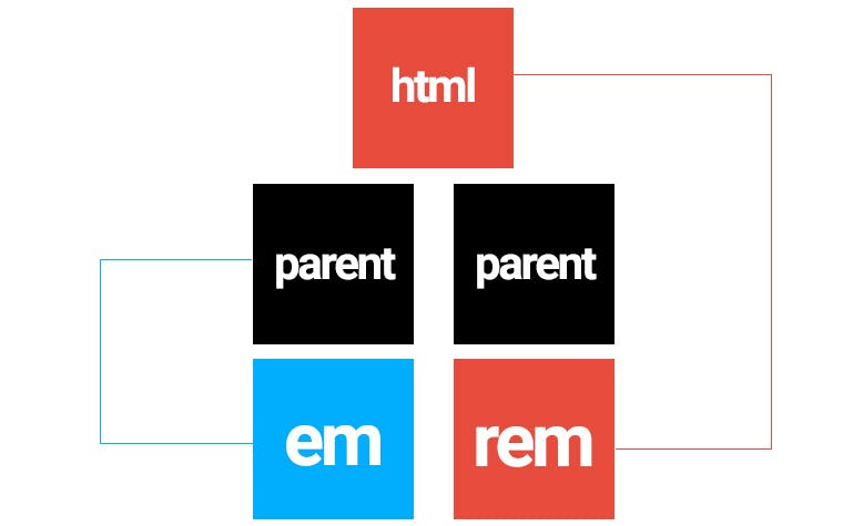
em: is a reference unit that is proportional to its immediate parent element or itself based on the value of the font-size attribute.
rem: is the reference unit of scale compared to the root element of the website here is the <html> tag based on the value of the font-size attribute
Look at the example:
CSS
html {
    font-size: 10px;
}
body {
    font-size: 20px;
}
.parent {
    margin: auto 0;
    font-size: 16px;
}
.em-child {
    font-size: 2em;
}
.rem-child {
    font-size: 2rem;
}
HTML
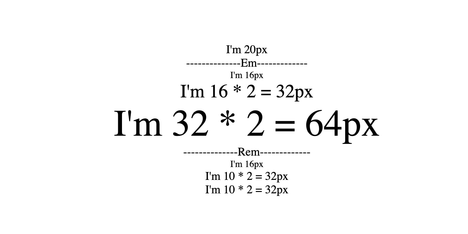
<p>I'm 20px</p>
<p>--------------Em-------------</p>
<div class="parent">
    <p>I'm 16px</p>
    <div class="em-child">
        <p>I'm 16 * 2 = 32px</p>
        <div class="em-child">
            <p>I'm 32 * 2 = 64px</p>
        </div>
    </div>
</div>
<p>--------------Rem-------------</p>
<div class="parent">
    <p>I'm 16px</p>
    <div class="rem-child">
        <p>I'm 10 * 2 = 32px</p>
        <div class="rem-child">
            <p>I'm 10 * 2 = 32px</p>
        </div>
    </div>
</div>
Result
Codepen